Introduction
In another place and another time, the Apple iPhone 8 Plus would have
been one of the hottest things around. Swathed in hype, causing a stir,
bringing the free ride of the competition's flagships to an abrupt and
painful halt.
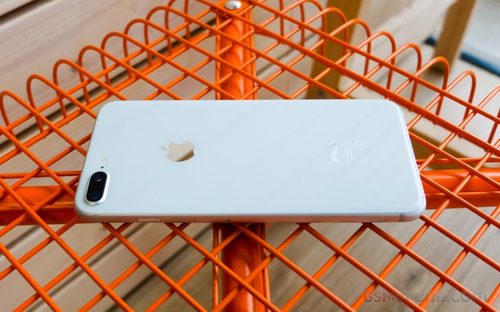
This turbo-powered, glass-clad, sharp-shooting and fast-charging
piece of a smartphone classic seems to have everything. Except... time.
No, it's not going anywhere. It's just that its days as one of the
hottest things around are numbered. Now, we're sure you know what we
mean, so let's slow down and start over. Time isn't always a luxury -
just don't tell this to an iPhone 8 Plus.
The 8 series is about to leave generations of iPhones behind. It's
been ten years of refining the visionary iPhone. We saw it grow bigger,
better, more durable, more powerful. Apple kept adding more screen real
estate, more processing power and advanced camera features. In spite of
all novelties, the iPhone essence was always there, underneath the fancy
add-ons. Now, that's about to change.
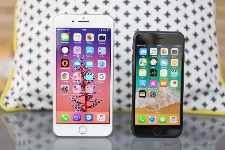
Apple isn't just on the verge of breaking clean from the past. The
future has already begun with the iPhone 8 and 8 Plus. But it doesn't
belong to them.
Back to the here and now, the Apple iPhone 8 Plus comes across as the
usual incremental upgrade. The 8 Plus gets to keep its overall styling
but swaps aluminum for glass and finally gets wireless charging. The new
A11 Bionic chipset boasts an extra two power-efficient cores and, for
the first time ever, an in-house GPU. Then the base iPhone storage has
been doubled and now starts at 64GB.
Browsing the camera specs leave the wrong impression of copy and
paste from the iPhone 7 Plus, when in fact both of the dual 12MP sensors
have bigger pixels, backed by a superior flash and an exclusive new
Portrait Lightning mode, which hopes to make the portrait shots look
even better.
Finally, the screen size and resolution might be the same, but Apple
has added HDR10 and Dolby Vision support, as well as iPad's True Tone
color adjustment for life-like color presentation.
Apple iPhone 8 Plus key features
- Body: Aluminum 7000 frame, reinforced glass front and rear,
IP67 certified for water and dust resistance. Gold, Space Gray, and
Silver color options.
- Screen: 5.5" 16M-color LED-backlit IPS LCD screen of 1080p resolution, 401ppi. True Tone adjustment via four-channel ambient light sensor, wide color gamut, 3D Touch
- OS: Apple iOS 11
- Chipset: Hexa-core (2 Monsoon + 4 Mistral) 2.09GHz Apple CPU, tri-core Apple GPU, 3GB of RAM, Apple A11 Bionic SoC
- Camera: Dual 12MP camera: wide-angle F/1.8 + telephoto
F/2.8, live bokeh effects (including Portrait mode and Portrait
Lightning), optical image stabilization, 2x lossless zoom, quad-LED
flash with slow sync, phase detection auto focus, wide color capture
- Video recording: 2160p@60/30fps, 1080p@30/60/120/240fps video recording
- Selfie: 7MP F/2.2 front-facing camera with BSI sensor and HDR mode, 1080p@30fps video
- Storage: 64GB or 256GB of built-in storage
- Connectivity: 4G LTE Cat.16 (1Gbps); Wi-Fi a/b/g/n/ac;
Bluetooth 5.0; Lightning port; GPS with A-GPS, GLONASS, GALILEO, QZSS;
NFC (Apple Pay and for the first time for NFC tag reading too)
- Battery: 2,691mAh battery, wireless charging (Qi compatible)
- Misc: Stereo speakers, Pressure-sensitive Home key with fingerprint scanner, Taptic Engine
Main shortcomings
- Design is getting long in the tooth now being used for the fourth year in a row
- Big screen bezels (soon to look even bigger in comparison to the iPhone X)
- No 3.5mm audio jack (ships with a Lightning-to-3.5mm adapter)
- No microSD slot
- iTunes is still required for manual music upload
- No fast charger provided in the box (and the optional one is expensive)
- Video camera still recording mono audio only
Indeed, the iPhone 8 Plus seems like a regular update but with the
right touches in the right places. The screen bezels are here to stay
but probably for the last time. The audio jack is already a goner,
that's for sure, while memory expansion was never meant to be.
Some may still have gripes with the over-reliance on the iTunes
software for music transfer to the phone, but in times of Apple Music,
Spotify, Google Music, and Groove - we think this is another issue we
mention one last time.
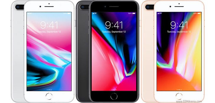
The iPhone 8 Plus is fresh off the assembly lines, but the iPhone X
is just around the corner, while the iPhone 7 Plus is still relevant and
cheaper.
Decisions... Is the upgrade worth it? Is a switch worth it? Should I
wait? The choice has never been harder, but the answers start rolling
right after the break.
Retail package
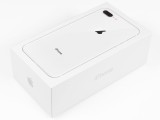
Apple has been consistent with the bundle for over 5 years, and the
box of the iPhone 8 Plus hides no surprises. Inside you'll find a
somewhat dated 5V/1A plug, a Lightning cable, a pair of EarPods and a
Lighting-to-Analog jack adapter.
To take advantage of the fast charging support, you'll need to spend
on a more powerful MacBook charger. However, the latter is available
only with a USB Type-C plug so that a USB-C-to-Lightning adapter will be
in order too. That's an extra 100 bucks or so to make use of a feature,
which supposedly came built-in. Not to mention that the MacBook charger
is way too big compared to a normal phone charger.
 Apple iPhone 8 Plus retail package
Apple iPhone 8 Plus 360-degree spin
The iPhone 8 Plus measures 158.4 x 78.1 x 7.5mm which is a hair
(0.2mm, to be precise) larger than the 7 Plus in each direction. This
means most of the old cases won't be a perfect fit (mostly in depth
though as our experiments confirmed).
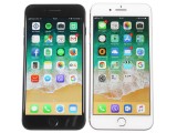
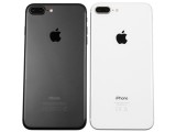
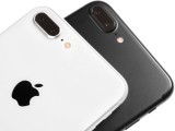
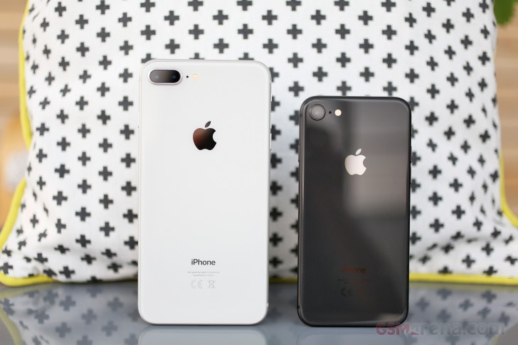
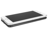 Apple iPhone 8 Plus next to the iPhone 7 Plus
The new 8 Plus model has gained 14g of weight and is a pretty heavy set at 202g.
Compared to the bezel-less iPhone X and the Galaxy S8 boasting 5.8"
screens, the iPhone 8 Plus is noticeably bigger. The iPhone X is 15mm
shorter and 7mm narrower, while the Galaxy S8 shaves off 10mm in both
directions.
Finally, the size gap between the regular iPhone 8 and 8 Plus is
significant - 20mm in height and 10mm in width. But that's not exactly
breaking news.
Design
Apple was the first maker to push the glass-sandwich design with the
iconic iPhone 4. The unthinkable became possible (using glass on a
phone), and it has since become mainstream. It was somewhat short-lived
though, replaced in just two years by the all-metal iPhone 5.
Fast-forward five years to find Apple pretty much the last company
revisiting all-glass builds to catch with the likes of Samsung and many
others who adopted glass and wireless charging years ago. Better late
than never we guess.
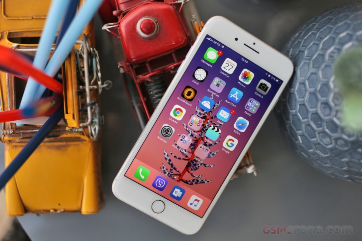
So, what's up with the iPhone 8 Plus? Not much, at least over at the
front side. Everything else is as we left it on the iPhone 7 Plus: the
footprint, screen size, sizeable bezels, physical Home key, sensors, and
the selfie camera placement. The oleophobic coating against fingerprint
smudges is a given, and that's something we wish to see on every
flagship out there. Oh, and the 8 Plus is still IP67-grade water
resistant.
The front glass ends on a subtle curve - a departure from the once
popular 2.5D finish. This would make applying screen protectors on the
iPhone 8 Plus easier and let them last longer.
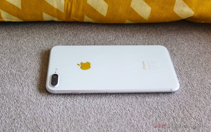
The rear glass is the highlight of the refined design. It's flat for
the most part but also ends on a subtle curve where it meets the
aluminum frame. There are no antenna bands you can notice, as these are
now well hidden beneath the glass.
Thanks to this change of heart Apple is finally bringing wireless
charging - a feature rumored to be coming with quite a few iPhones
already. The team over at Cupertino chose the Qi standard, so the iPhone
8 Plus is compatible with all existing Qi chargers - the most common
standard for the technology. You bet Apple will be pushing some fancier
units later this year. In 2018 Apple hopes to, we will likely also see a
proprietary Apple wireless charger that will replenish a Watch, an
iPhone, and the AirPods all at once all while showing the charging
progress indicator of all three on the iPhone's screen. This won't be
easy as allegedly, the Qi charging standard would have to be adjusted to
accommodate that feature so that it remains universally compatible.
Only time would tell if that will really happen.
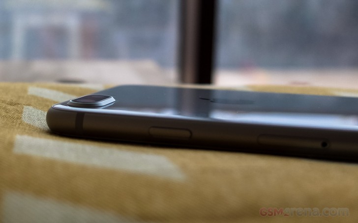
The dual-camera on the iPhone 8 Plus uses new sensors though it keeps
the same specs for both - 12MP with f/1.8 lens for the wide-angle and
12MP with f/2.8 lens for the telephoto cam. There are some new cool
portrait effects and a slow-sync flash though. As far as the hump is
concerned - it's still there, bulging over everything, but protected
behind sapphire glass (which is not that hard to scratch mind you).
Apple likes to tout its new reinforced glass panels used on the
iPhone 8, 8 Plus, and X as the toughest glass on the planet. If drop
tests all over YouTube are anything to go by, the new Apple phones
somehow fail to live up to the hype, though. Even worse, our own 8 Plus
got its screen scratched by the smaller iPhone 8 we stacked on top of it
for a quick comparison picture.
The final piece of the Apple iPhone 8 Plus is the Series 7000
aluminum frame running along the sides. This is the only place you can
see the beginning and the end of the antennas. The frame has a
sandblasted-like finish and improves the otherwise slippery grip.
The iPhone 8 Plus with its prominent screen bezels is one of the
largest 5.5-inchers on the market. It's not huge by any means, it just
feels oversized, and it is heavy. But handling the 8 Plus is as premium
experience as ever, the build is solid, and the profile thin enough. The
aluminum frame boosts the grip, while the glass panels are sweet on the
eyes. Even though the 8 Plus is not comfortable to work with just one
hand, the added one-hand-friendly gestures will surely help in improving
the overall usability.
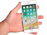
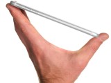 Handling the iPhone 8 Plus
Device overview
A quick look over the iPhone 8 Plus reveals no surprises. Most of the
front is taken by the 5.5" IPS LCD screen and its bezels. Above the
display is the earpiece, which also serves as a speaker, the FaceTime
camera, and a couple of sensors.
Below the screen is the Home Key, force-press enabled just like on
the iPhone 7 series. The ultra-fast fingerprint sensor, also known as
Touch ID, is embedded within that key.
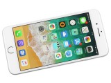
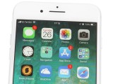
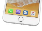 The iPhone 8 Plus • the earpiece and the FaceTime cam • the Home key
The left side of the iPhone 8 Plus has the silencer toggle and the
volume keys. The power/lock button and the nanoSIM tray are on the
right.
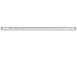
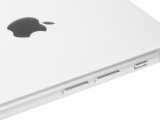
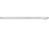
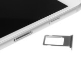 The left side • the volume controls • the right side • the SIM tray
The top is completely bare. The Lightning port is at the bottom
flanked by two grilles - one for the mouthpiece, and the other one for
the second speaker.
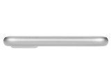
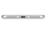
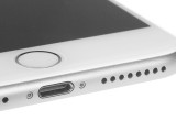 The top • the bottom • the Lightning port
Finally, the dual-camera is seen on the back, accompanied by a quad-LED dual-tone flash.
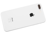
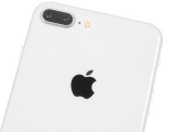
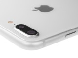 The back of the iPhone 8 Plus • the dual-camera setup • the camera hump
There is nothing out of the ordinary so far and no wonder. Apple is
now using this design for the fourth year in a row after it was first
introduced on the iPhone 6. Sure, the back is all glass now, but you
would never guess you are holding the latest iPhone just by looking at
the front.




 This turbo-powered, glass-clad, sharp-shooting and fast-charging
piece of a smartphone classic seems to have everything. Except... time.
No, it's not going anywhere. It's just that its days as one of the
hottest things around are numbered. Now, we're sure you know what we
mean, so let's slow down and start over. Time isn't always a luxury -
just don't tell this to an iPhone 8 Plus.
 Apple isn't just on the verge of breaking clean from the past. The
future has already begun with the iPhone 8 and 8 Plus. But it doesn't
belong to them.
 The iPhone 8 Plus is fresh off the assembly lines, but the iPhone X
is just around the corner, while the iPhone 7 Plus is still relevant and
cheaper.


 So, what's up with the iPhone 8 Plus? Not much, at least over at the
front side. Everything else is as we left it on the iPhone 7 Plus: the
footprint, screen size, sizeable bezels, physical Home key, sensors, and
the selfie camera placement. The oleophobic coating against fingerprint
smudges is a given, and that's something we wish to see on every
flagship out there. Oh, and the 8 Plus is still IP67-grade water
resistant.
 The rear glass is the highlight of the refined design. It's flat for
the most part but also ends on a subtle curve where it meets the
aluminum frame. There are no antenna bands you can notice, as these are
now well hidden beneath the glass.
 Apple likes to tout its new reinforced glass panels used on the
iPhone 8, 8 Plus, and X as the toughest glass on the planet. If drop
tests all over YouTube are anything to go by, the new Apple phones
somehow fail to live up to the hype, though. Even worse, our own 8 Plus
got its screen scratched by the smaller iPhone 8 we stacked on top of it
for a quick comparison picture.
 The iPhone 8 Plus with its prominent screen bezels is one of the
largest 5.5-inchers on the market. It's not huge by any means, it just
feels oversized, and it is heavy. But handling the 8 Plus is as premium
experience as ever, the build is solid, and the profile thin enough. The
aluminum frame boosts the grip, while the glass panels are sweet on the
eyes. Even though the 8 Plus is not comfortable to work with just one
hand, the added one-hand-friendly gestures will surely help in improving
the overall usability.


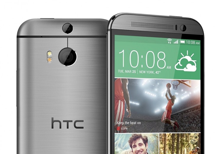 The HTC One m8
The secondary camera in this system works similarly. With the second
camera, the system can now tell roughly how far the objects in front of
it are with respect to each other. This information is then used to
separate the foreground subject from the background.
 Sample from the HTC One m8. Didn’t always work this well.
While sound in theory and occasionally in practice, this technique
has its pitfalls. Unless your subject is a cardboard cutout, it will
have depth to it and because this depth is not as much as the depth
between the entire subject and the background, the camera occasionally
ends up blurring the edges of the subject as well. Even when it does
work reasonably well, it never quite looks natural, especially since
most smartphone cameras that have this feature apply an even blur on
everything in the background whereas with a DSLR, the intensity of the
blur increases with the distance from the focus point.
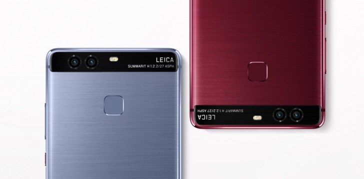 Huawei P9
Every time you take a picture, the camera system combines the output
of both cameras and layers them into one image. In theory, the two
images when combined will have greater detail and reduced noise.
Alternately, you can also just shoot from the monochrome camera and get
slightly better image quality at the cost of all the color information.
 Monochrome image from P9
There is no real disadvantage to this system and we do appreciate
that it’s the only one of the systems discussed here that tries to do
anything about the actual image quality instead of adding additional
features but still, we would rather take some zooming ability over
marginally improved image quality.
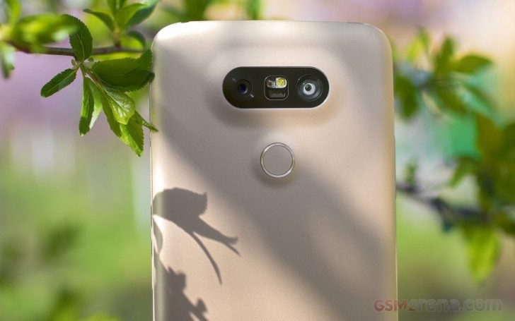 LG G5
We have mainly seen this on LG phones, with Motorola recently incorporating it in the
  Wide-angle on top and ultra wide-angle below from G5
With good implementation, this system does have the potential to be a
really cool second camera system for particular scenarios and we wish
more manufacturers adopted it.
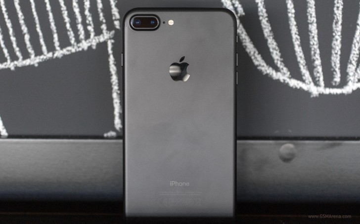 Apple iPhone 7 Plus
Since the iPhone 7 Plus, manufacturers have stuck to using a 2x
factor for the second telephoto lens. This means the secondary lens has
twice the focal length of the primary lens, giving you an instant 2x
optical zoom.
 Wide-angle above and telephoto below from the iPhone 7 Plus
Shooting with a telephoto lens also has other advantages. Telephoto
lenses are more suitable for portraits than wide angle as they have less
distortion and is more flattering to the subject. Most manufacturers go
one step ahead and also implement the background blur effect that we
saw with the very first system we talked about today (the primary lens
now acts as the depth sensor). The combination of a telephoto lens and
background blur gives far superior results than just applying background
blur on wide-angle images.